L1- How to Display Data on a Run Chart
Why You Need a Run Chart?
A run chart is an effective way to show change over a specific period of time.
Example:
If a hospital gets complaints about wait times in ER. As an improvement team, we will need to come up with a specific aim and plan for measuring to check the results as we do changes to fix the issues we have. The key measure ( the data upon which you will gauge your progress ) is the percentage of patients that leave ER without been seen every month. It can be calculated as follows:
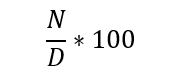
where:
- N = number of patients who leave ER without begin seen.
- D = total number of patients.
The aim ( the overall goal of your improvement project ) is to get the percentage of leave without been seen by ER to below 1%.
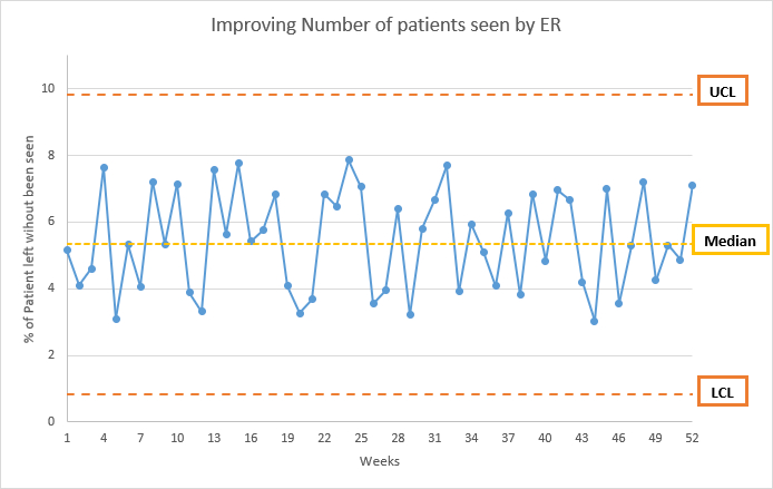
The Basic Elements of a Run Chart
In our previous example, let’s say we have data of one year, the basic elements for our run chart will be:
- Time along the X-axis.
- Our key measure Number of patients left without been seen along the Y-axis.
- Labels on the X and Y-axis.
- Title for the chart.
- The median of our key measure.
- Any other information such as:
- UCL (Upper control limit) is calculated by adding the average (median) to 3 times the standard deviation.
- LCL (Lower control limit) is calculated by subtracting the average (median) to 3 times the standard deviation.
- Annotations to specific events that affected the result on a specific week.
Note:
Excel function to get the average, median, LCL and UCL:
- Average:
=AVERAGE(column).- Median:
=median(column).- Standard Deviation:
=STDEV(column).- UCL:
=AVERAGE(column) + (STDEV(column) * 3 ).- LCL:
=AVERAGE(column) - (STDEV(column) * 3 ).
an example of the result chart is:
excel file, with the data and chart, can be found here.
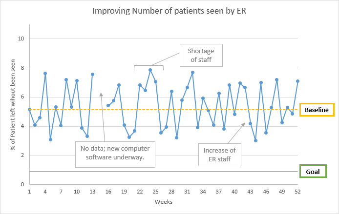
Baselines, Goal Lines, and Other Annotations
- Annotations are comments we add to the chart. Add comments to show changes that affected the run chart.
- Base Line is a line that shows the performance before the start of our test of improvements. The baseline is the median of your measurements from the time prior to any specific tests of change or improvement. We need at least five data points to create a baseline median.
- Goal Line is a line to show our goal.
This is how the previous chart looks like with annotations, baseline, and goal line.
excel file, with the data and chart, can be found here.
Computer Programs for Run Charts
Click here to see a quick video on how to create a run chart in excel.