L3 - Histograms, Pareto Charts, and Scatter Plots
Tools to Help You Understand Variation
There are other charts that can help us understand our data better. Those charts are:
- Histograms: To see the distribution of a set of continuous data.
- Pareto charts: A bar chart, each bar length represent the frequency, and it is arranged from longest to shortest.
- Scatter plots: Plots observations as points to show the relationship between two sets of data. for example heights and weight, experience and salary.
Different charts can offer us new insight. But not all of them can apply to every project.
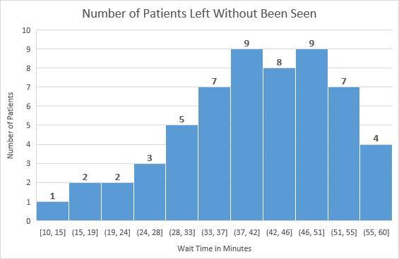
Histograms
Histograms are a special type of bar chart. Just like run charts, histograms help us see the variation in continuous data.
Example:
Let’s say we have records of ER visits, when they registered and when they were called to see the doctor, the result is the waiting time for the patients, we want to see how long they waited before they left the ER. The final sum of minutes can be shown in the following table:
| Minutes (Time called - Time registered) | Number of patients |
|---|---|
| 10 | 2 |
| 15 | 2 |
| 20 | 2 |
| 25 | 3 |
| 30 | 5 |
| 35 | 7 |
| 40 | 9 |
| 45 | 8 |
| 50 | 9 |
| 55 | 7 |
| 60 | 4 |
this is how the chart will look like:
excel file, with the data and chart, can be found here.
My steps to create histograms chart (can be found in the previous excel file):
- Collect continuous data.
- Divide data into categories (bins), you can do that by seeing where your data ranges from and to, in our example, it ranges from 10 to 60, so we will create 11 bins, each bin represents 5 minutes.
- Count your data based on the bins. You can do this in many ways using functions like:
=COUNTIFS(column,">=30", column,"<35")this counts all values greater or equal to 30 and less than 35, in this example, it should return 5. you can see all functions in the excel file by clicking the cell - Chart. Insert > Charts > Statistics Charts > Histogram.
Pareto Charts
A combination of bar chart and line chart, Pareto chart can help us find the defects to prioritize them in order to make the greatest overall improvement. This is how to make a Pareto chart:
- Graph normal bar chart.
- Rearrange your data from highest to lowest.
- Find the percentage of each bar from the total. (check the excel file under the graph to know how to write the function in excel)
- Find the cumulative percentage for each bar. (check the excel file under the graph to know how to write the function in excel)
- Draw a line for the results of step 4.
Now we look for the issues that have the biggest effect, the vital few, which are those in the 20% category, which are the ones with the highest impact on our data. See the graph below to know how to find the vital few.
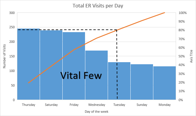
excel file, with the data and chart, can be found here.
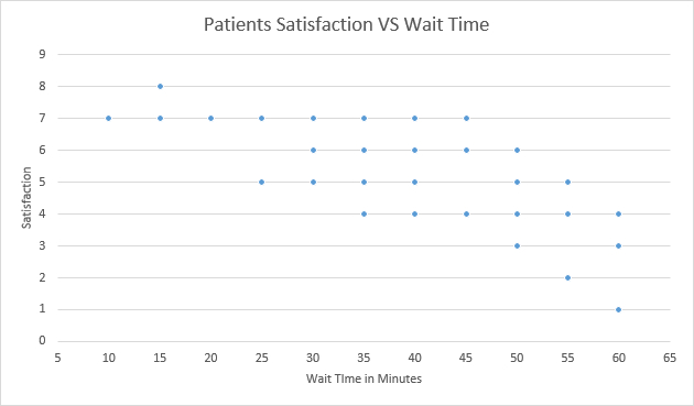
Scatter Plots
Scatter charts help us to find the relationship between two variables.
Example:
Let’s work on the same example before but I will add satisfaction to it, so each visitor will fill a form telling how satisfied he/she is. We collected this data and created the chart:
excel file, with the data and chart, can be found here.
As we can see, as the time increasing, patient satisfaction decrease, so we have a negative relationship between waiting time and satisfaction, otherwise if the satisfaction increases we will say we have a positive relationship. If the dots are showing random locations and you can’t tell if it increasing or decreasing then we would say that there is no correlation.